class: center, middle, inverse, title-slide .title[ # BANL 6100: Business Analytics ] .subtitle[ ## Data Visualization ] .author[ ### Mehmet Balcilar </br> <a href="mailto:mbalcilar@newhaven.edu" class="email">mbalcilar@newhaven.edu</a> ] .institute[ ### Univeristy of New Haven ] .date[ ### 2023-09-28 (updated: 2023-10-02) ] --- class: center, middle, sydney-blue # Data Visualization using ggplot2 --- class: middle > “The simple graph has brought more information to the data analyst’s mind than any other device.” <br> <br> --- John Tukey --- ## A Brief History Based on [The Grammar of Graphics](https://smile.amazon.com/Grammar-Graphics-Statistics-Computing/dp/0387245448) by Leland Wilkinson (2000). ggplot releases: + [ggplot1](https://github.com/hadley/ggplot1) was released in April, 2006. + __Do NOT use this release.__ + Hadley uses it as a guide for API design in R. + [ggplot2](https://github.com/tidyverse/ggplot2) was released in June, 2007. + Feature freeze in February 2014. + The official extension mechanism was added in December 2015. --- ## The Layered Grammar of Graphics If you're interested in the theoretical underpinnings of ggplot2: <p> [The Layered Grammar of Graphics](https://vita.had.co.nz/papers/layered-grammar.html) by Hadley Wickham (2010). + Contrasts the ggplot2 approach with the earlier approach by Wilkenson + Introduces the concept of layers + Added to the existing R programming language --- ## The Benefits of using a Grammar > “A grammar of graphics is a tool that enables us to concisely describe the components of a graphic.” <br> <br> --- Hadley Wickham The most important reason is the grammar: + The MIT "language gives us power over problems" approach to problem solving + See relationships between graphs, components and data that might not be obvious otherwise + A higher level of abstraction than pen and paper approaches + Provides a concise way of thinking about the connection between data and graphs --- ## Why Should I use ggplot2? + Charts are more elegant than those found in base R + Well supported; Provides a wide variety of charts and themes + Well designed API (OOP plus FP plus DSL) + Building charts in layers is quite intuitive > **“The transferrable skills from ggplot2 are not the idiosyncracies of plotting syntax, but a powerful way of thinking about visualisation, as a way of** mapping between variables and the visual properties of geometric objects **that you can perceive.”** <br> <br> **--- Hadley Wickham** --- ## Why Should I use ggplot2? ### My personal reasons - .hl[Functional] data visualization 1. Wrangle data 2. Map data to visual elements 3. Tweak scales, guides, axis, labels, theme - Easy to .hl[reason] about how data drives visualization - Easy to .hl[iterate] - Easy to be .hl[consistent] ### .hl[Plus:] **stunning figures** --- layout: true ## G is for getting started --- ### Load the tidyverse ```r library(tidyverse) ``` ``` ## ── Attaching core tidyverse packages ────────────────────────────────── tidyverse 2.0.0 ── ## ✔ dplyr 1.1.3 ✔ readr 2.1.4 ## ✔ forcats 1.0.0 ✔ stringr 1.5.0 ## ✔ ggplot2 3.4.3 ✔ tibble 3.2.1 ## ✔ lubridate 1.9.2 ✔ tidyr 1.3.0 ## ✔ purrr 1.0.2 ## ── Conflicts ──────────────────────────────────────────────────── tidyverse_conflicts() ── ## ✖ dplyr::filter() masks stats::filter() ## ✖ dplyr::lag() masks stats::lag() ## ℹ Use the conflicted package (<http://conflicted.r-lib.org/>) to force all conflicts to become errors ``` --- ### Other packages you'll need for this adventure We'll use an excerpt of the [gapminder](http://www.gapminder.org/data/) dataset provided by the [`gapminder` package](https://github.com/jennybc/gapminder) by Jenny Bryan. <https://github.com/jennybc/gapminder> ```r ## install.packages("gapminder") library(gapminder) ``` --- layout: false class: inverse center middle text-white .font200[gg is for<br>Grammar of Graphics] --- ## What is a grammar of graphics? .left-code[ "Good grammar is just the first step in creating a good sentence." #### How is the drawing on the right connected to data? .footnote[<http://vita.had.co.nz/papers/layered-grammar.pdf>] ] .right-plot[ <img src="6-Visualization-with-ggplot_files/figure-html/guess-data-from-plot-0-1.png" width="100%" /> ] --- layout: true ## Guess the data behind this plot? .left-code[ ### MPG Ratings of Cars - Manufacturer - Car Type (Class) - City MPG - Highway MPG ] --- .right-plot[ <img src="6-Visualization-with-ggplot_files/figure-html/guess-data-from-plot-2-1.png" width="100%" /> ] --- .right-plot[ <img src="6-Visualization-with-ggplot_files/figure-html/guess-data-from-plot-3-1.png" width="100%" /> ] --- .right-plot[ <img src="6-Visualization-with-ggplot_files/figure-html/guess-data-from-plot-1-1.png" width="100%" /> ] --- .right-plot[ <img src="6-Visualization-with-ggplot_files/figure-html/guess-data-from-plot-4-1.png" width="100%" /> ] --- .right-plot[ <img src="6-Visualization-with-ggplot_files/figure-html/guess-data-from-plot-5-1.png" width="100%" /> ] --- .right-plot[ <img src="6-Visualization-with-ggplot_files/figure-html/guess-data-from-plot-6-1.png" width="100%" /> ] --- .right-plot[ <table> <thead> <tr> <th style="text-align:left;"> manufacturer </th> <th style="text-align:left;"> class </th> <th style="text-align:right;"> cty </th> <th style="text-align:right;"> hwy </th> <th style="text-align:left;"> model </th> </tr> </thead> <tbody> <tr> <td style="text-align:left;"> audi </td> <td style="text-align:left;"> compact </td> <td style="text-align:right;"> 21 </td> <td style="text-align:right;"> 30 </td> <td style="text-align:left;"> a4 </td> </tr> <tr> <td style="text-align:left;"> audi </td> <td style="text-align:left;"> compact </td> <td style="text-align:right;"> 17 </td> <td style="text-align:right;"> 25 </td> <td style="text-align:left;"> a4 quattro </td> </tr> <tr> <td style="text-align:left;"> ford </td> <td style="text-align:left;"> suv </td> <td style="text-align:right;"> 12 </td> <td style="text-align:right;"> 18 </td> <td style="text-align:left;"> expedition 2wd </td> </tr> <tr> <td style="text-align:left;"> ford </td> <td style="text-align:left;"> suv </td> <td style="text-align:right;"> 13 </td> <td style="text-align:right;"> 19 </td> <td style="text-align:left;"> explorer 4wd </td> </tr> <tr> <td style="text-align:left;"> toyota </td> <td style="text-align:left;"> suv </td> <td style="text-align:right;"> 16 </td> <td style="text-align:right;"> 20 </td> <td style="text-align:left;"> 4runner 4wd </td> </tr> <tr> <td style="text-align:left;"> toyota </td> <td style="text-align:left;"> compact </td> <td style="text-align:right;"> 22 </td> <td style="text-align:right;"> 31 </td> <td style="text-align:left;"> camry solara </td> </tr> <tr> <td style="text-align:left;"> toyota </td> <td style="text-align:left;"> compact </td> <td style="text-align:right;"> 28 </td> <td style="text-align:right;"> 37 </td> <td style="text-align:left;"> corolla </td> </tr> <tr> <td style="text-align:left;"> toyota </td> <td style="text-align:left;"> suv </td> <td style="text-align:right;"> 13 </td> <td style="text-align:right;"> 18 </td> <td style="text-align:left;"> land cruiser wagon 4wd </td> </tr> </tbody> </table> ] --- layout: false ## How do we express visuals in words? .font120[ - **Data** to be visualized ] -- .font120[ - **.hlb[Geom]etric objects** that appear on the plot ] -- .font120[ - **.hlb[Aes]thetic mappings** from data to visual component ] -- .font120[ - **.hlb[Stat]istics** transform data on the way to visualization ] -- .font120[ - **.hlb[Coord]inates** organize location of geometric objects ] -- .font120[ - **.hlb[Scale]s** define the range of values for aesthetics ] -- .font120[ - **.hlb[Facet]s** group into subplots ] --- layout: true ## gg is for Grammar of Graphics .left-column[ ### Data ```r ggplot(data) ``` ] --- .right-column[ #### Tidy Data 1. Each variable forms a .hl[column] 2. Each observation forms a .hl[row] 3. Each observational unit forms a table ] -- .right-column[ #### Start by asking 1. What information do I want to use in my visualization? 1. Is that data contained in .hl[one column/row] for a given data point? ] --- .right-column[ <table> <thead> <tr> <th style="text-align:left;"> country </th> <th style="text-align:right;"> 1997 </th> <th style="text-align:right;"> 2002 </th> <th style="text-align:right;"> 2007 </th> </tr> </thead> <tbody> <tr> <td style="text-align:left;"> Canada </td> <td style="text-align:right;"> 30.30584 </td> <td style="text-align:right;"> 31.90227 </td> <td style="text-align:right;"> 33.39014 </td> </tr> <tr> <td style="text-align:left;"> China </td> <td style="text-align:right;"> 1230.07500 </td> <td style="text-align:right;"> 1280.40000 </td> <td style="text-align:right;"> 1318.68310 </td> </tr> <tr> <td style="text-align:left;"> United States </td> <td style="text-align:right;"> 272.91176 </td> <td style="text-align:right;"> 287.67553 </td> <td style="text-align:right;"> 301.13995 </td> </tr> </tbody> </table> ] -- .right-column[ ```r tidy_pop <- gather(messy_pop, 'year', 'pop', -country) ``` <table> <thead> <tr> <th style="text-align:left;"> country </th> <th style="text-align:left;"> year </th> <th style="text-align:right;"> pop </th> </tr> </thead> <tbody> <tr> <td style="text-align:left;"> Canada </td> <td style="text-align:left;"> 1997 </td> <td style="text-align:right;"> 30.306 </td> </tr> <tr> <td style="text-align:left;"> China </td> <td style="text-align:left;"> 1997 </td> <td style="text-align:right;"> 1230.075 </td> </tr> <tr> <td style="text-align:left;"> United States </td> <td style="text-align:left;"> 1997 </td> <td style="text-align:right;"> 272.912 </td> </tr> <tr> <td style="text-align:left;"> Canada </td> <td style="text-align:left;"> 2002 </td> <td style="text-align:right;"> 31.902 </td> </tr> <tr> <td style="text-align:left;"> China </td> <td style="text-align:left;"> 2002 </td> <td style="text-align:right;"> 1280.400 </td> </tr> <tr> <td style="text-align:left;"> United States </td> <td style="text-align:left;"> 2002 </td> <td style="text-align:right;"> 287.676 </td> </tr> <tr> <td style="text-align:left;"> Canada </td> <td style="text-align:left;"> 2007 </td> <td style="text-align:right;"> 33.390 </td> </tr> <tr> <td style="text-align:left;"> China </td> <td style="text-align:left;"> 2007 </td> <td style="text-align:right;"> 1318.683 </td> </tr> <tr> <td style="text-align:left;"> United States </td> <td style="text-align:left;"> 2007 </td> <td style="text-align:right;"> 301.140 </td> </tr> </tbody> </table> ] --- layout: true ## gg is for Grammar of Graphics .left-column[ ### Data ### Aesthetics ```r + aes() ``` ] --- .right-column[ Map data to visual elements or parameters - year - pop - country ] --- .right-column[ Map data to visual elements or parameters - year → **x** - pop → **y** - country → *shape*, *color*, etc. ] --- .right-column[ Map data to visual elements or parameters ```r aes( x = year, y = pop, color = country ) ``` ] --- layout: true ## gg is for Grammar of Graphics .left-column[ ### Data ### Aesthetics ### Geoms ```r + geom_*() ``` ] --- .right-column[ Geometric objects displayed on the plot <img src="6-Visualization-with-ggplot_files/figure-html/geom_demo-1.png" width="650px" /> ] --- .right-column[ Here are the [some of the most widely used geoms](https://eric.netlify.com/2017/08/10/most-popular-ggplot2-geoms/) .font70.center[ | Type | Function | |:----:|:--------:| | Point | `geom_point()` | | Line | `geom_line()` | | Bar | `geom_bar()`, `geom_col()` | | Histogram | `geom_histogram()` | | Regression | `geom_smooth()` | | Boxplot | `geom_boxplot()` | | Text | `geom_text()` | | Vert./Horiz. Line | `geom_{vh}line()` | | Count | `geom_count()` | | Density | `geom_density()` | <https://eric.netlify.com/2017/08/10/most-popular-ggplot2-geoms/> ] ] --- .right-column[ See <http://ggplot2.tidyverse.org/reference/> for many more options .font70[ ``` ## [1] "geom_abline" "geom_area" "geom_bar" ## [4] "geom_bin_2d" "geom_bin2d" "geom_blank" ## [7] "geom_boxplot" "geom_col" "geom_contour" ## [10] "geom_contour_filled" "geom_count" "geom_crossbar" ## [13] "geom_curve" "geom_density" "geom_density_2d" ## [16] "geom_density_2d_filled" "geom_density2d" "geom_density2d_filled" ## [19] "geom_dotplot" "geom_errorbar" "geom_errorbarh" ## [22] "geom_freqpoly" "geom_function" "geom_hex" ## [25] "geom_histogram" "geom_hline" "geom_jitter" ## [28] "geom_label" "geom_line" "geom_linerange" ## [31] "geom_map" "geom_path" "geom_point" ## [34] "geom_pointrange" "geom_polygon" "geom_qq" ## [37] "geom_qq_line" "geom_quantile" "geom_raster" ## [40] "geom_rect" "geom_ribbon" "geom_rug" ## [43] "geom_segment" "geom_sf" "geom_sf_label" ## [46] "geom_sf_text" "geom_smooth" "geom_spoke" ## [49] "geom_step" "geom_text" "geom_tile" ## [52] "geom_violin" "geom_vline" ``` ] ] -- .right-column[ <img src="images/geom.gif" width="200px" style="float: right; margin-right: 100px; margin-top: -25px;"> Or just start typing `geom_` in RStudio ] --- layout: true ## Our first plot! --- .left-code[ ```r ggplot(tidy_pop) ``` ] .right-plot[ <img src="6-Visualization-with-ggplot_files/figure-html/first-plot1a-out-1.png" width="100%" /> ] --- .left-code[ ```r ggplot(tidy_pop) + * aes(x = year, * y = pop) ``` ] .right-plot[ <img src="6-Visualization-with-ggplot_files/figure-html/first-plot1b-out-1.png" width="100%" /> ] --- .left-code[ ```r ggplot(tidy_pop) + aes(x = year, y = pop) + * geom_point() ``` ] .right-plot[ <img src="6-Visualization-with-ggplot_files/figure-html/first-plot1c-out-1.png" width="100%" /> ] --- .left-code[ ```r ggplot(tidy_pop) + aes(x = year, y = pop, * color = country) + geom_point() ``` ] .right-plot[ <img src="6-Visualization-with-ggplot_files/figure-html/first-plot1-out-1.png" width="100%" /> ] --- .left-code[ ```r ggplot(tidy_pop) + aes(x = year, y = pop, color = country) + geom_point() + * geom_line() ``` .font80[ ```r geom_path: Each group consists of only one observation. Do you need to adjust the group aesthetic? ``` ] ] .right-plot[ <img src="6-Visualization-with-ggplot_files/figure-html/first-plot2-fake-out-1.png" width="100%" /> ] --- .left-code[ ```r ggplot(tidy_pop) + aes(x = year, y = pop, color = country) + geom_point() + geom_line( * aes(group = country)) ``` ] .right-plot[ <img src="6-Visualization-with-ggplot_files/figure-html/first-plot2-out-1.png" width="100%" /> ] --- .left-code[ ```r g <- ggplot(tidy_pop) + aes(x = year, y = pop, color = country) + geom_point() + geom_line( aes(group = country)) g ``` ] .right-plot[ <img src="6-Visualization-with-ggplot_files/figure-html/first-plot3-out-1.png" width="100%" /> ] --- layout: true ## gg is for Grammar of Graphics .left-column[ ### Data ### Aesthetics ### Geoms ```r + geom_*() ``` ] --- .right-column[ ```r geom_*(mapping, data, stat, position) ``` - `data` Geoms can have their own data - Has to map onto global coordinates - `map` Geoms can have their own aesthetics - Inherits global aesthetics - Have geom-specific aesthetics - `geom_point` needs `x` and `y`, optional `shape`, `color`, `size`, etc. - `geom_ribbon` requires `x`, `ymin` and `ymax`, optional `fill` - `?geom_ribbon` ] --- .right-column[ ```r geom_*(mapping, data, stat, position) ``` - `stat` Some geoms apply further transformations to the data - All respect `stat = 'identity'` - Ex: `geom_histogram` uses `stat_bin()` to group observations - `position` Some adjust location of objects - `'dodge'`, `'stack'`, `'jitter'` ] --- layout: true ## gg is for Grammar of Graphics .left-column[ ### Data ### Aesthetics ### Geoms ### Facet ```r +facet_wrap() +facet_grid() ``` ] --- .right-column[ ```r g + facet_wrap(~ country) ``` <img src="6-Visualization-with-ggplot_files/figure-html/geom_facet-1.png" width="90%" /> ] --- .right-column[ ```r g + facet_grid(continent ~ country) ``` <img src="6-Visualization-with-ggplot_files/figure-html/geom_grid-1.png" width="90%" /> ] --- layout: true ## gg is for Grammar of Graphics .left-column[ ### Data ### Aesthetics ### Geoms ### Facet ### Labels ```r + labs() ``` ] --- .right-column[ ```r g + labs(x = "Year", y = "Population") ``` <img src="6-Visualization-with-ggplot_files/figure-html/labs-ex-1.png" width="90%" /> ] --- layout: true ## gg is for Grammar of Graphics .left-column[ ### Data ### Aesthetics ### Geoms ### Facet ### Labels ### Coords ```r + coord_*() ``` ] --- .right-column[ ```r g + coord_flip() ``` <img src="6-Visualization-with-ggplot_files/figure-html/coord-ex-1.png" width="90%" /> ] --- .right-column[ ```r g + coord_polar() ``` <img src="6-Visualization-with-ggplot_files/figure-html/coord-ex2-1.png" width="90%" /> ] --- layout: true ## gg is for Grammar of Graphics .left-column[ ### Data ### Aesthetics ### Geoms ### Facet ### Labels ### Coords ### Scales ```r + scale_*_*() ``` ] --- .right-column[ `scale` + `_` + `<aes>` + `_` + `<type>` + `()` What parameter do you want to adjust? → `<aes>` <br> What type is the parameter? → `<type>` - I want to change my discrete x-axis<br>`scale_x_discrete()` - I want to change range of point sizes from continuous variable<br>`scale_size_continuous()` - I want to rescale y-axis as log<br>`scale_y_log10()` - I want to use a different color palette<br>`scale_fill_discrete()`<br>`scale_color_manual()` ] --- .right-column[ ```r g + scale_color_manual(values = c("peru", "pink", "plum")) ``` <img src="6-Visualization-with-ggplot_files/figure-html/scale_ex1-1.png" width="90%" /> ] --- .right-column[ ```r g + scale_y_log10() ``` <img src="6-Visualization-with-ggplot_files/figure-html/scale_ex2-1.png" width="90%" /> ] --- .right-column[ ```r g + scale_x_discrete(labels = c("MCMXCVII", "MMII", "MMVII")) ``` <img src="6-Visualization-with-ggplot_files/figure-html/scale_ex4-1.png" width="90%" /> ] --- layout: true ## gg is for Grammar of Graphics .left-column[ ### Data ### Aesthetics ### Geoms ### Facet ### Labels ### Coords ### Scales ### Theme ```r + theme() ``` ] --- .right-column[ Change the appearance of plot decorations<br> i.e. things that aren't mapped to data A few "starter" themes ship with the package - `g + theme_bw()` - `g + theme_dark()` - `g + theme_gray()` - `g + theme_light()` - `g + theme_minimal()` ] --- .right-column[ Huge number of parameters, grouped by plot area: - Global options: `line`, `rect`, `text`, `title` - `axis`: x-, y- or other axis title, ticks, lines - `legend`: Plot legends - `panel`: Actual plot area - `plot`: Whole image - `strip`: Facet labels ] --- .right-column[ Theme options are supported by helper functions: - `element_blank()` removes the element - `element_line()` - `element_rect()` - `element_text()` ] --- .right-column[ ```r g + theme_bw() ``` <img src="6-Visualization-with-ggplot_files/figure-html/unnamed-chunk-1-1.png" width="90%" /> ] --- .right-column[ .font80[ ```r g + theme_minimal() + theme(text = element_text(family = "Palatino")) ``` <img src="6-Visualization-with-ggplot_files/figure-html/unnamed-chunk-2-1.png" width="90%" /> ] ] --- .right-column[ You can also set the theme globally with `theme_set()` ```r my_theme <- theme_bw() + theme( text = element_text(family = "Palatino", size = 12), panel.border = element_rect(colour = 'grey80'), panel.grid.minor = element_blank() ) theme_set(my_theme) ``` All plots will now use this theme! ] --- .right-column[ ```r g ``` <img src="6-Visualization-with-ggplot_files/figure-html/unnamed-chunk-3-1.png" width="90%" /> ] --- .right-column[ ```r g + theme(legend.position = 'bottom') ``` <img src="6-Visualization-with-ggplot_files/figure-html/unnamed-chunk-4-1.png" width="90%" /> ] --- layout: false ## Save Your Work To save your plot, use **ggsave** ```r ggsave( filename = "my_plot.png", plot = my_plot, width = 10, height = 8, dpi = 100, device = "png" ) ``` --- layout: false count: hide class: fullscreen, inverse, top, left, text-white background-image: url(images/super-grover.jpg) .font200[You have the power!] --- class: inverse, center, middle # "Live" Coding ```r library(gapminder) ``` --- ## head(gapminder) ``` ## # A tibble: 6 × 6 ## country continent year lifeExp pop gdpPercap ## <fct> <fct> <int> <dbl> <int> <dbl> ## 1 Afghanistan Asia 1952 28.8 8425333 779. ## 2 Afghanistan Asia 1957 30.3 9240934 821. ## 3 Afghanistan Asia 1962 32.0 10267083 853. ## 4 Afghanistan Asia 1967 34.0 11537966 836. ## 5 Afghanistan Asia 1972 36.1 13079460 740. ## 6 Afghanistan Asia 1977 38.4 14880372 786. ``` --- ## glimpse(gapminder) ``` Rows: 1,704 Columns: 6 $ country <fct> "Afghanistan", "Afghanistan", "Afghanistan", "Afghanistan", "Afghanist… $ continent <fct> Asia, Asia, Asia, Asia, Asia, Asia, Asia, Asia, Asia, Asia, Asia, Asia… $ year <int> 1952, 1957, 1962, 1967, 1972, 1977, 1982, 1987, 1992, 1997, 2002, 2007… $ lifeExp <dbl> 28.801, 30.332, 31.997, 34.020, 36.088, 38.438, 39.854, 40.822, 41.674… $ pop <int> 8425333, 9240934, 10267083, 11537966, 13079460, 14880372, 12881816, 13… $ gdpPercap <dbl> 779.4453, 820.8530, 853.1007, 836.1971, 739.9811, 786.1134, 978.0114, … ``` -- Let's start with `lifeExp` vs `gdpPercap` --- class: fullscreen layout: true --- .left-code[ ```r ggplot(gapminder) + aes(x = gdpPercap, y = lifeExp) ``` ] .right-plot[  ] -- Add points... --- .left-code[ ```r ggplot(gapminder) + aes(x = gdpPercap, y = lifeExp) + * geom_point() ``` ] .right-plot[  ] -- How can I tell countries apart? --- .left-code[ ```r ggplot(gapminder) + aes(x = gdpPercap, y = lifeExp, * color = continent) + geom_point() ``` ] .right-plot[  ] -- GDP is squished together on the left --- .left-code[ ```r ggplot(gapminder) + aes(x = gdpPercap, y = lifeExp, color = continent) + geom_point() + * scale_x_log10() ``` ] .right-plot[  ] -- Still lots of overlap in the countries... --- .left-code[ ```r ggplot(gapminder) + aes(x = gdpPercap, y = lifeExp, color = continent) + geom_point() + scale_x_log10() + * facet_wrap(~ continent) + * guides(color = FALSE) ``` No need for color legend thanks to facet titles ] .right-plot[ 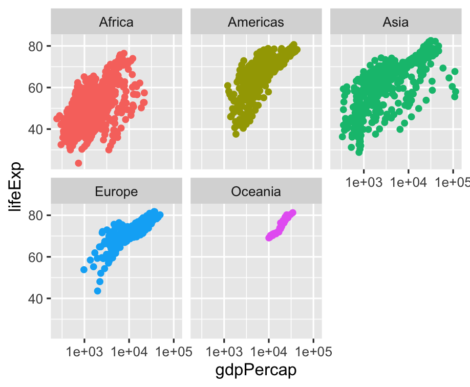 ] -- Lots of overplotting due to point size --- .left-code[ ```r ggplot(gapminder) + aes(x = gdpPercap, y = lifeExp, color = continent) + * geom_point(size = 0.25) + scale_x_log10() + facet_wrap(~ continent) + guides(color = FALSE) ``` ] .right-plot[ 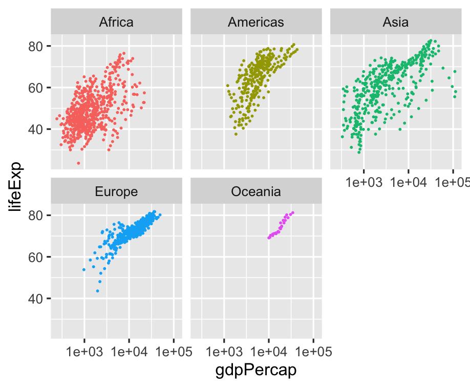 ] -- Is there a trend? --- .left-code[ ```r ggplot(gapminder) + aes(x = gdpPercap, y = lifeExp, color = continent) + * geom_line() + geom_point(size = 0.25) + scale_x_log10() + facet_wrap(~ continent) + guides(color = FALSE) ``` ] .right-plot[  ] -- Okay, that line just connected all of the points sequentially... --- .left-code[ ```r ggplot(gapminder) + aes(x = gdpPercap, y = lifeExp, color = continent) + geom_line( * aes(group = country) ) + geom_point(size = 0.25) + scale_x_log10() + facet_wrap(~ continent) + guides(color = FALSE) ``` .font200.center[🤔] ] .right-plot[ 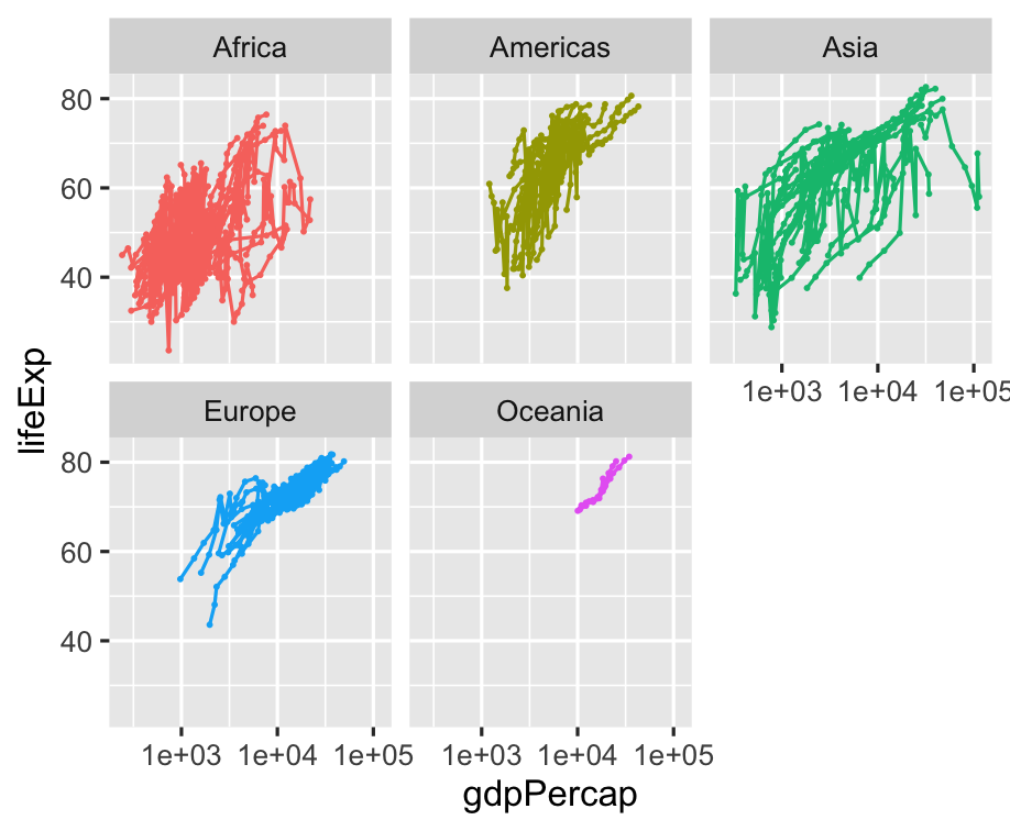 ] -- 💡 We need time on x-axis! --- .left-code[ ```r ggplot(gapminder) + * aes(x = year, * y = gdpPercap, color = continent) + geom_line( aes(group = country) ) + geom_point(size = 0.25) + * scale_y_log10() + facet_wrap(~ continent) + guides(color = FALSE) ``` ] .right-plot[ 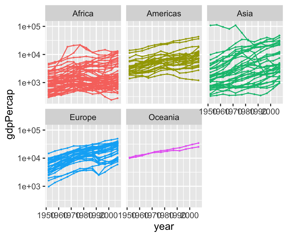 ] -- Can't see x-axis labels, though --- .left-code[ ```r ggplot(gapminder) + aes(x = year, y = gdpPercap, color = continent) + geom_line( aes(group = country) ) + geom_point(size = 0.25) + scale_y_log10() + * scale_x_continuous(breaks = * seq(1950, 2000, 25) * ) + facet_wrap(~ continent) + guides(color = FALSE) ``` ] .right-plot[  ] -- What about life expectancy? --- .left-code[ ```r ggplot(gapminder) + aes(x = year, * y = lifeExp, color = continent) + geom_line( aes(group = country) ) + geom_point(size = 0.25) + * #scale_y_log10() + scale_x_continuous(breaks = seq(1950, 2000, 25) ) + facet_wrap(~ continent) + guides(color = FALSE) ``` ] .right-plot[  ] -- Okay, let's add a trend line --- .left-code[ ```r ggplot(gapminder) + aes(x = year, y = lifeExp, color = continent) + geom_line( aes(group = country) ) + geom_point(size = 0.25) + * geom_smooth() + scale_x_continuous(breaks = seq(1950, 2000, 25) ) + facet_wrap(~ continent) + guides(color = FALSE) ``` ] .right-plot[  ] -- De-emphasize individual countries --- .left-code[ ```r ggplot(gapminder) + aes(x = year, y = lifeExp, color = continent) + geom_line( aes(group = country), * color = "grey75" ) + geom_point(size = 0.25) + geom_smooth() + scale_x_continuous(breaks = seq(1950, 2000, 25) ) + facet_wrap(~ continent) + guides(color = FALSE) ``` ] .right-plot[  ] -- Points are still in the way --- .left-code[ ```r ggplot(gapminder) + aes(x = year, y = lifeExp, color = continent) + geom_line( aes(group = country), color = "grey75" ) + * #geom_point(size = 0.25) + geom_smooth() + scale_x_continuous(breaks = seq(1950, 2000, 25) ) + facet_wrap(~ continent) + guides(color = FALSE) ``` ] .right-plot[ 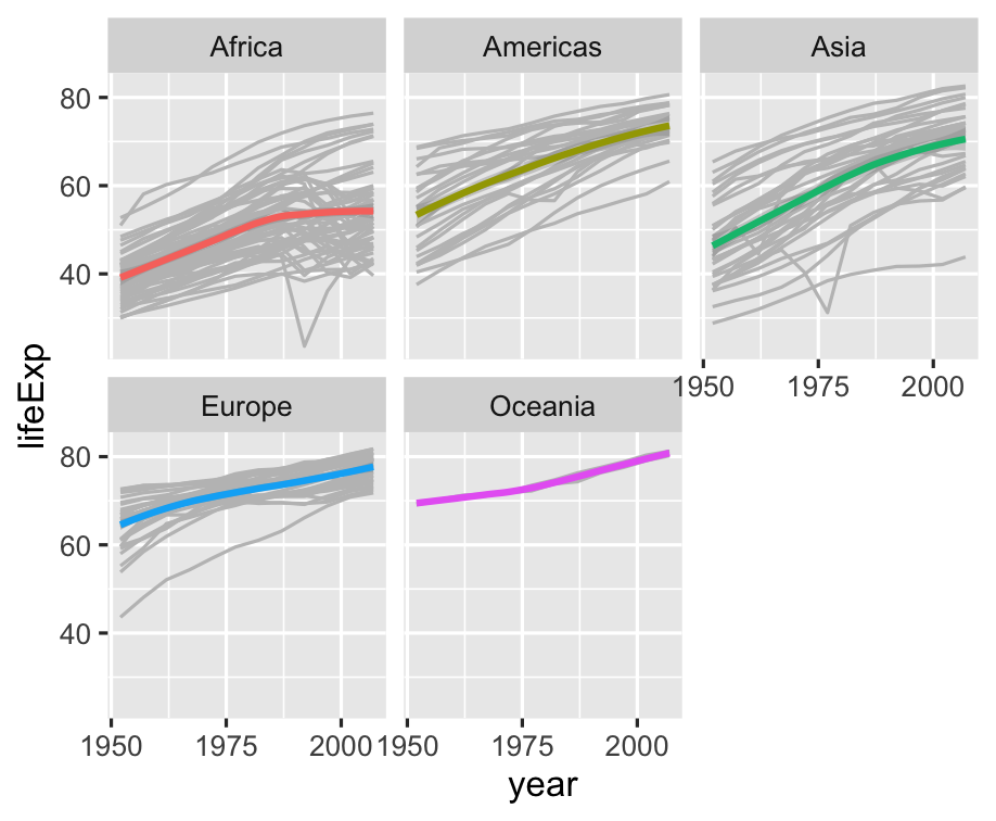 ] -- Let's compare continents --- .left-code[ ```r ggplot(gapminder) + aes(x = year, y = lifeExp, color = continent) + geom_line( aes(group = country), color = "grey75" ) + geom_smooth() + # scale_x_continuous( # breaks = # seq(1950, 2000, 25) # ) + * # facet_wrap(~ continent) + guides(color = FALSE) ``` ] .right-plot[ 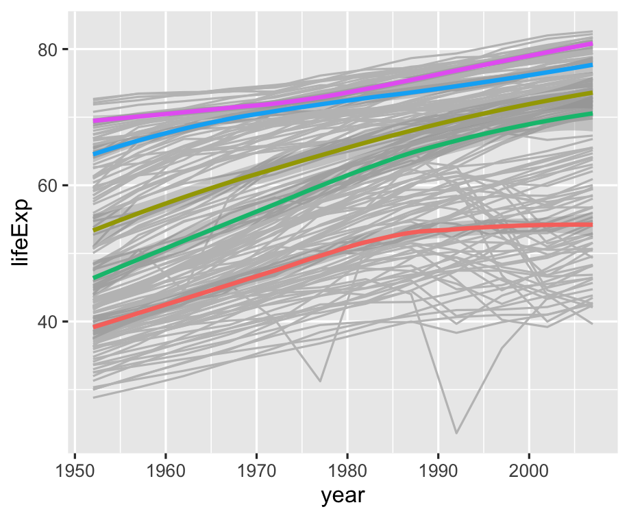 ] -- Wait, what color is each continent? --- .left-code[ ```r ggplot(gapminder) + aes(x = year, y = lifeExp, color = continent) + geom_line( aes(group = country), color = "grey75" ) + geom_smooth() + * theme( * legend.position = "bottom" * ) ``` ] .right-plot[ 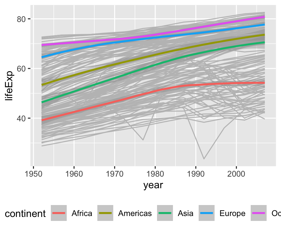 ] -- Let's try the minimal theme --- .left-code[ ```r ggplot(gapminder) + aes(x = year, y = lifeExp, color = continent) + geom_line( aes(group = country), color = "grey75" ) + geom_smooth() + * theme_minimal() + theme( legend.position = "bottom" ) ``` ] .right-plot[ 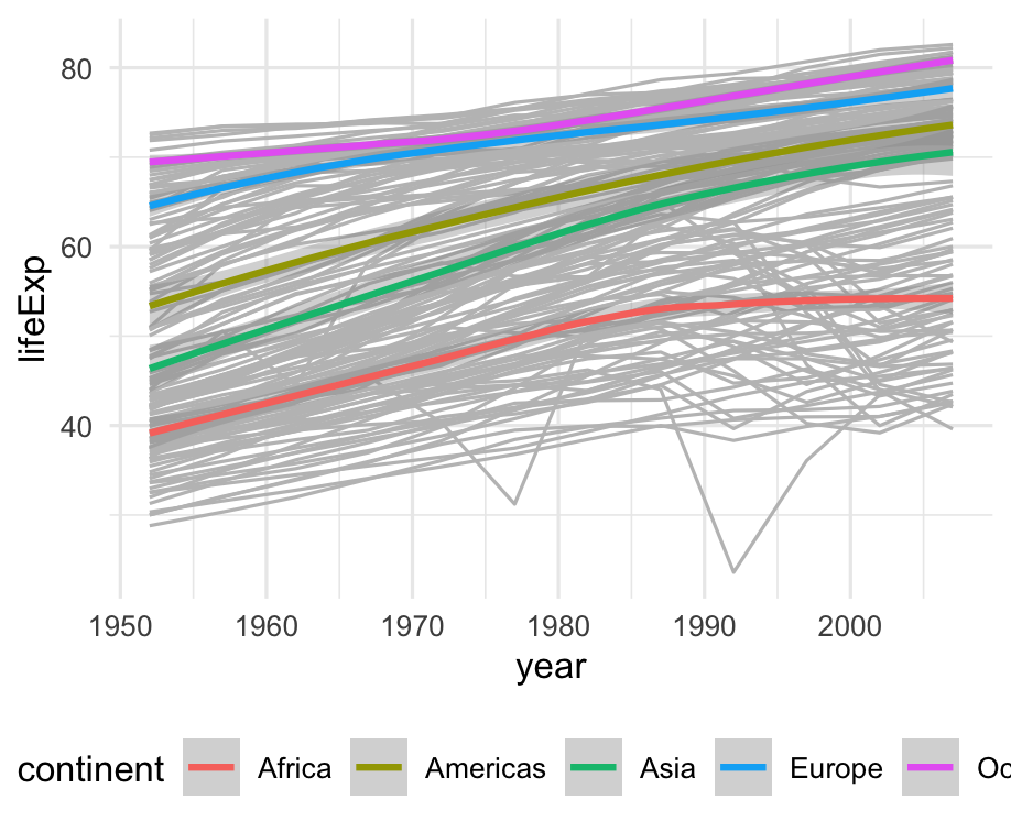 ] -- Fonts are kind of big --- .left-code[ ```r ggplot(gapminder) + aes(x = year, y = lifeExp, color = continent) + geom_line( aes(group = country), color = "grey75" ) + geom_smooth() + theme_minimal( * base_size = 8) + theme( legend.position = "bottom" ) ``` ] .right-plot[  ] -- Cool, let's switch gears --- .left-code[ ```r americas <- gapminder %>% filter( country %in% c( "United States", "Canada", "Mexico", "Ecuador" ) ) ``` Let's look at four countries in more detail. How do their populations compare to each other? ] .right-plot[ <!--  --> ``` ## # A tibble: 48 × 6 ## country continent year lifeExp pop gdpPercap ## <fct> <fct> <int> <dbl> <int> <dbl> ## 1 Canada Americas 1952 68.8 14785584 11367. ## 2 Canada Americas 1957 70.0 17010154 12490. ## 3 Canada Americas 1962 71.3 18985849 13462. ## 4 Canada Americas 1967 72.1 20819767 16077. ## 5 Canada Americas 1972 72.9 22284500 18971. ## 6 Canada Americas 1977 74.2 23796400 22091. ## 7 Canada Americas 1982 75.8 25201900 22899. ## 8 Canada Americas 1987 76.9 26549700 26627. ## 9 Canada Americas 1992 78.0 28523502 26343. ## 10 Canada Americas 1997 78.6 30305843 28955. ## # ℹ 38 more rows ``` ] --- .left-code[ ```r ggplot(americas) + aes( x = year, y = pop ) + geom_col() ``` ] .right-plot[  ] -- Yeah, but how many people are in each country? --- .left-code[ ```r ggplot(americas) + aes( x = year, y = pop, * fill = country ) + geom_col() ``` ] .right-plot[  ] -- Bars are "stacked", can we separate? --- .left-code[ ```r ggplot(americas) + aes( x = year, y = pop, fill = country ) + geom_col( * position = "dodge" ) ``` `position = "dodge"` places objects _next to each other_ instead of overlapping ] .right-plot[  ] -- 🤓 What is scientific notation anyway? --- .left-code[ ```r ggplot(americas) + aes( x = year, * y = pop / 10^6, fill = country ) + geom_col( position = "dodge" ) ``` ggplot aesthetics can take expressions! ] .right-plot[ 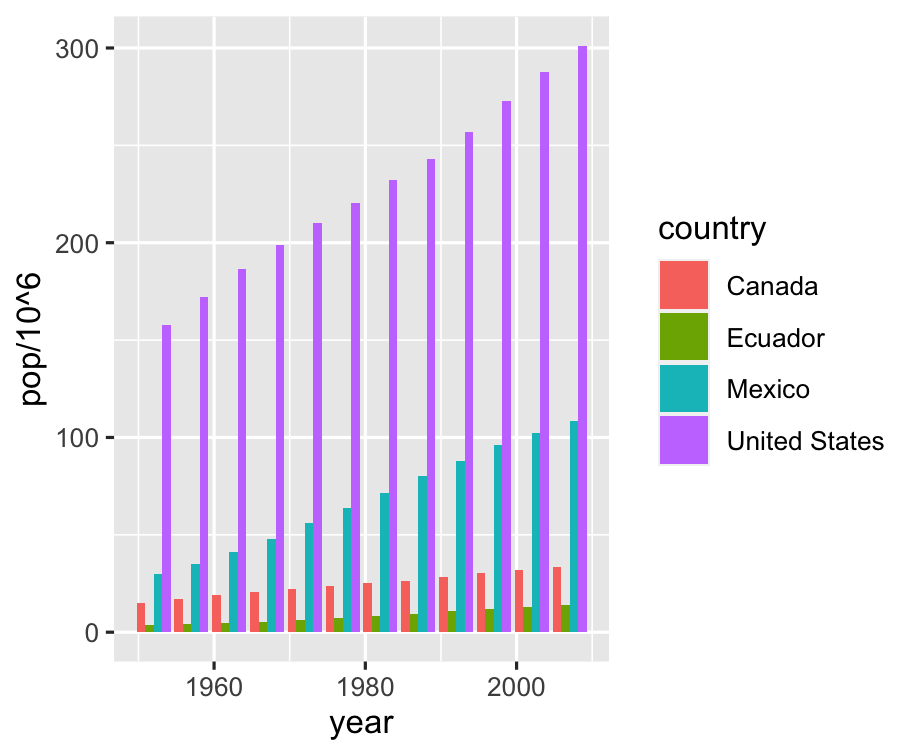 ] -- Might be easier to see countries individually --- .left-code[ ```r ggplot(americas) + aes( x = year, y = pop / 10^6, fill = country ) + geom_col( position = "dodge" ) + * facet_wrap(~ country) + * guides(fill = FALSE) ``` ] .right-plot[ 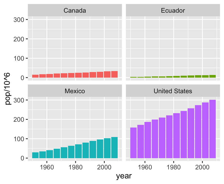 ] -- Let range of y-axis vary in each plot --- .left-code[ ```r ggplot(americas) + aes( x = year, y = pop / 10^6, fill = country ) + geom_col( position = "dodge" ) + facet_wrap(~ country, * scales = "free_y") + guides(fill = FALSE) ``` ] .right-plot[ 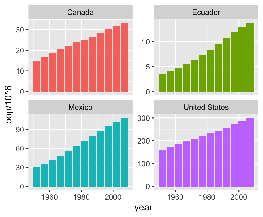 ] -- What about life expectancy again? --- .left-code[ ```r ggplot(americas) + aes( x = year, * y = lifeExp, fill = country ) + geom_col( position = "dodge" ) + facet_wrap(~ country, scales = "free_y") + guides(fill = FALSE) ``` ] .right-plot[ 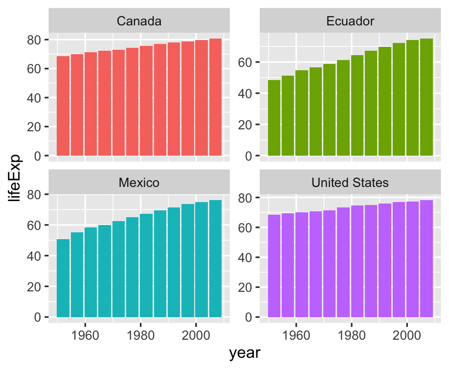 ] -- This should really be 📈 instead of 📊 --- .left-code[ ```r ggplot(americas) + aes( x = year, y = lifeExp, fill = country ) + * geom_line() + facet_wrap(~ country, scales = "free_y") + guides(fill = FALSE) ``` ] .right-plot[  ] -- 📊 are **fill**ed, 📈 are **color**ed --- .left-code[ ```r ggplot(americas) + aes( x = year, y = lifeExp, * color = country ) + geom_line() + facet_wrap(~ country, scales = "free_y") + * guides(color = FALSE) ``` ] .right-plot[  ] -- Altogether now! --- .left-code[ ```r ggplot(americas) + aes( x = year, y = lifeExp, color = country ) + geom_line() ``` ] .right-plot[  ] -- .right-plot[ Okay, changing gears again. What is range of life expectancy in Americas? ] --- .left-code[ ```r gapminder %>% filter( continent == "Americas" * ) %>% * ggplot() + aes( x = year, y = lifeExp ) ``` You can pipe into `ggplot()`! Just watch for `%>%` changing to `+` ] .right-plot[  ] -- Boxplot for life expectancy range --- .left-code[ ```r gapminder %>% filter( continent == "Americas" ) %>% ggplot() + aes( x = year, y = lifeExp ) + * geom_boxplot() ``` ] .right-plot[  ] -- Why not boxplots by year? --- .left-code[ ```r gapminder %>% filter( continent == "Americas" ) %>% * mutate( * year = factor(year) * ) %>% ggplot() + aes( x = year, y = lifeExp ) + geom_boxplot() ``` ] .right-plot[  ] -- OK, what about global life expectancy? --- .left-code[ ```r gapminder %>% # filter( # continent == "Americas" # ) %>% mutate( year = factor(year) ) %>% ggplot() + aes( x = year, y = lifeExp ) + geom_boxplot() ``` ] .right-plot[  ] -- Can we have cute little boxplots for each continent? --- .left-code[ ```r gapminder %>% mutate( year = factor(year) ) %>% ggplot() + aes( x = year, y = lifeExp, * fill = continent ) + geom_boxplot() ``` ] .right-plot[  ] -- Hard to read years, let's rotate 🔄 --- .left-code[ ```r gapminder %>% mutate( year = factor(year) ) %>% ggplot() + aes( x = year, y = lifeExp, fill = continent ) + geom_boxplot() + * coord_flip() ``` ] .right-plot[  ] -- Use `dplyr` to group by decade --- .left-code[ ```r gapminder %>% mutate( * decade = floor(year / 10), * decade = decade * 10, * decade = factor(decade) ) %>% ggplot() + aes( * x = decade, y = lifeExp, fill = continent ) + geom_boxplot() + coord_flip() ``` ] .right-plot[  ] -- Let's hide Oceania, sorry 🇦🇺🇳🇿🇮🇩🇫🇯🇵🇬 --- .left-code[ ```r g <- gapminder %>% * filter( * continent != "Oceania" * ) %>% mutate( decade = floor(year / 10) * 10, decade = factor(decade) ) %>% ggplot() + aes( x = decade, y = lifeExp, fill = continent ) + geom_boxplot() + coord_flip() ``` ] .right-plot[  ] --- .left-code[ ```r g + theme_minimal(8) + labs( y = "Life Expectancy", x = "Decade", fill = NULL, title = "Life Expectancy by Continent and Decade", caption = "gapminder.org" ) ``` Note `x` and `y` are _original_ aesthetics, `coord_flip()` happens _after_. Remove labels by setting `= NULL`. ] .right-plot[  ] --- layout: false class: inverse, center, middle # Level up ```r Inspired by "The Best Stats You've Ever Seen" by Hans Rosling http://www.ted.com/talks/hans_rosling_shows_the_best_stats_you_ve_ever_seen ``` --- ## Create the initial layout ```r g_hr <- ggplot(gapminder) + aes(x = gdpPercap, y = lifeExp, size = pop, color = country) + geom_point() + facet_wrap(~year) ``` .plot-callout[  ] --- ## Hide the guides ```r g_hr <- ggplot(gapminder) + aes(x = gdpPercap, y = lifeExp, size = pop, color = country) + geom_point() + facet_wrap(~year) + guides(color = FALSE, size = FALSE) ``` .plot-callout[  ] --- ## Adjust scales of x-axis, color, and size ```r g_hr <- g_hr + scale_x_log10(breaks = c(10^3, 10^4, 10^5), labels = c("1k", "10k", "100k")) + scale_color_manual(values = gapminder::country_colors) + scale_size(range = c(0.5, 12)) ``` .plot-callout[  ] --- ## Tweak Anotations <br><br> ```r g_hr <- g_hr + labs( x = "GDP per capita", y = "Life Expectancy" ) + theme_minimal(base_family = "Fira Sans") + theme( strip.text = element_text(size = 16, face = "bold"), panel.border = element_rect(fill = NA, color = "grey40"), panel.grid.minor = element_blank() ) ``` .plot-callout.top-right[  ] --- ## The final code and plot .font70[ ```r ggplot(gapminder) + aes(x = gdpPercap, y = lifeExp, size = pop, color = country) + geom_point() + facet_wrap(~year) + guides(color = FALSE, size = FALSE) + scale_x_log10( breaks = c(10^3, 10^4, 10^5), labels = c("1k", "10k", "100k")) + scale_color_manual(values = gapminder::country_colors) + scale_size(range = c(0.5, 12)) + labs( x = "GDP per capita", y = "Life Expectancy") + theme_minimal(14, base_family = "Fira Sans") + theme( strip.text = element_text(size = 16, face = "bold"), panel.border = element_rect(fill = NA, color = "grey40"), panel.grid.minor = element_blank()) ``` ] --- class: fullscreen background-image: url(6-Visualization-with-ggplot_files/figure-html/hans-rosling-final-1.png) background-size: cover --- ## Special Bonus: Animated! .left-code[ .font70[ ```r # library(devtools) # install_github("thomasp85/gganimate") library(gganimate) # Same plot without facet_wrap() g_hra + transition_states(year, 1, 0) + ggtitle("{closest_state}") ``` ] ] -- .right-plot[  ] --- layout: false class: inverse, middle, center # g is for Goodbye --- layout: true ## Stack Exchange is Awesome ---  --- <img src="images/stack-exchange-answer.png" style="max-height: 100%"> --- layout: false ## ggplot2 Extensions: exts.ggplot2.tidyverse.org/gallery <img src="images/ggplot2-exts-gallery.png" style="max-height: 100%"> --- ## ggplot2 and beyond ### Learn more - **ggplot2 docs:** <http://ggplot2.tidyverse.org/> - **R4DS - Data visualization:** <http://r4ds.had.co.nz/data-visualisation.html> - **Hadley Wickham's ggplot2 book:** <https://www.amazon.com/dp/0387981403/> ### Noteworthy RStudio Add-Ins - [esquisse](https://github.com/dreamRs/esquisse): Interactively build ggplot2 plots - [ggplotThemeAssist](https://github.com/calligross/ggthemeassist): Customize your ggplot theme interactively - [ggedit](https://github.com/metrumresearchgroup/ggedit): Layer, scale, and theme editing